Basic startpage guide
Let's make a simple and cosy startpage. Generally, I think it's a great idea to read through the entirety of MDN's Getting started with the web. If you are new to web development, this will significantly increase your understanding of everything going on.
If you do not want to increase your knowledge that much, the bare bones on HTML and CSS ought to do...
The start of something new

Create a single file on your computer: index.html. The name of the file
actually doesn't matter too much, what really matters is the ending .html,
always include that.
Open this file in a text editor of your choice (We recommend using VS Code). You should be faced with... an empty file.
Let's give it some life, start by typing out (better) or copying (worse) the HTML below:
<!DOCTYPE html>
<html>
<head>
  <title>New tab</title>
</head>
<body>
  <h1>Cool, eh?</h1>
</body>
</html>
If look at the above text and don't understand it, please read the first paragraph again.
If you drag this file over to your browser, you should be able to see a page with just the words "Cool, eh?" displayed in the top left corner.
That isn't much of a startpage, though. Let's add some links!
...
<body>
  <h1>Cool, eh?</h1>
  <a href="https://stpg.tk/">/wg/-/stpg/</a>
  <a href="https://www.theonion.com/">News</a>
  <a href="https://send.firefox.com/">FF Send</a>
</body>
...
Note I use ellipsis ... to remove text that is not relevant to what we are
changing. The full HTML is at the bottom of the page.
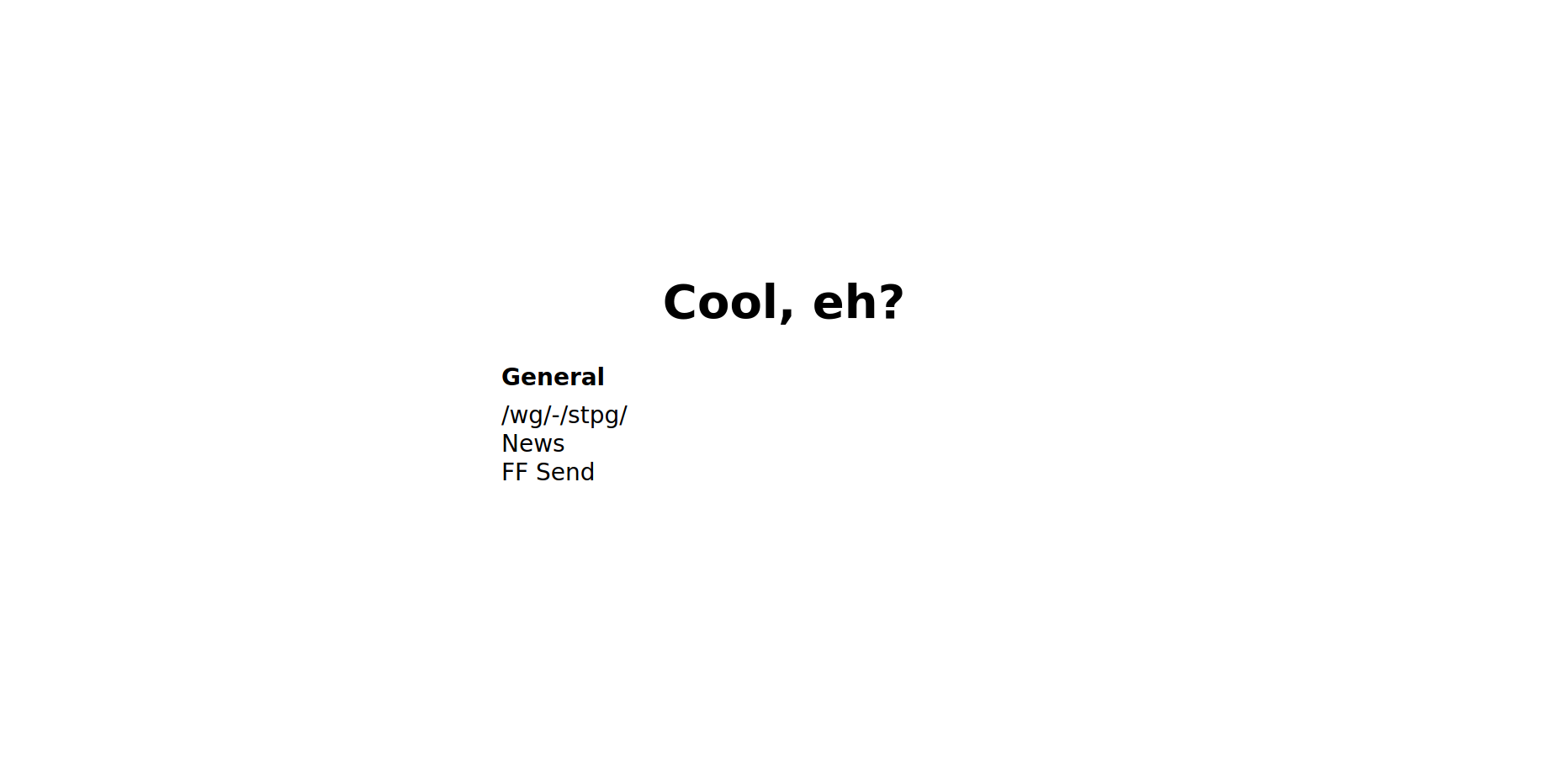
Now this is a startpage, a catchy text followed by a few useful links for our daily use.
 - A little too minimal :)
And again, but with more pizzazz#
Now we are going to add a bit of flare to our startpage. For this we need to style it using CSS. With opened file, add the following lines:
...
<head>
  <title>New tab</title>

  <style>
    html {
      align-items: center;
      display: flex;
      height: 100%;
      justify-content: center;
      margin: 0;
    }
  </style>
</head>
...
Refresh the page where you opened your file or simply drag it over again if you closed it, you should now see all of your text is centered in the middle of the page. Well done, you have achieved one of the hardest tasks in CSS.
Let's make a few changes to our HTML structure, we need it to be more defined in order to have more granular control over what goes where and how it looks.
...
<body>
  <nav>
    <h1>Cool, eh?</h1>
    <ul>
      <li>General</li>
      <li><a href="https://stpg.tk/">/wg/-/stpg/</a></li>
      <li><a href="https://www.theonion.com/">News</a></li>
      <li><a href="https://send.firefox.com/">FF Send</a></li>
    </ul>
  </nav>
</body>
...
And let's add a few style rules in the <head> block of our document:
...
  <style>
    html {
      align-items: center;
      display: flex;
      height: 100%;
      justify-content: center;
      margin: 0;
    }

    body {
      display: flex;
      margin: 1em;
      padding: 1em;
    }

    h1 {
      font-size: 2em;
      grid-column: 1 / -1;
      margin: 0;
      text-align: center;
    }

    a {
      color: inherit;
      text-decoration: none;
    }
  </style>
</head>
...
So far so good, but we need to kick it up a notch! We are about to do a lot more!
Let's get everything looking a little more coherent, we are going to give everything space to breathe and live.
...
    a {
      color: inherit;
      text-decoration: none;
    }

    a:focus,
    a:hover {
      color: #1d81b2;
    }

    nav {
      display: grid;
      grid-row-gap: 1em;
      grid-template-columns: 1fr 1fr;
      margin: 0 1em;
      min-width: 24em;
      padding: 1em 0;
    }

    ul {
      list-style-type: none;
      margin: 0;
      padding: 0;
      white-space: nowrap;
    }

    li:first-child {
      font-weight: bold;
      line-height: 2em;
    }
  </style>
</head>
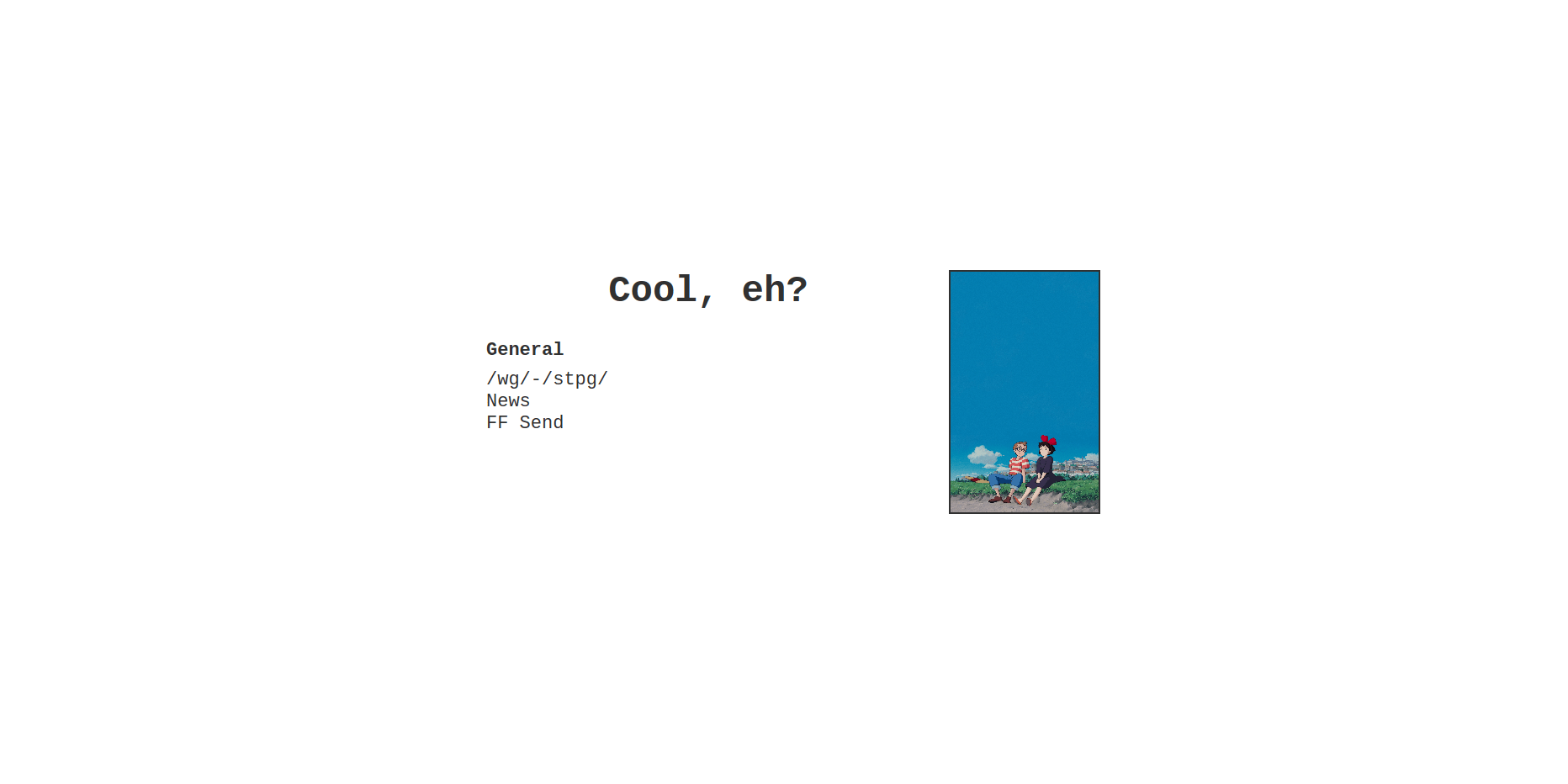
 - How far we've come! (200% zoom because it's a little small right now)
Okay! We added a lot of styling rules right there, a quick synopsis is that we made the links change color when they are hovered over, added some sizing to the startpage, and finally give the first item in each list boldness to make the section titles stand out...
If you are confused about the way display: grid works/what it does, have a
look here.
The icing on the startpage#
Everything we have done so far got us what is essentially a startpage. Let's add a few quick changes and make it cosy!
...
  <style>
    html {
      align-items: center;
      color: #313131;
      display: flex;
      font: 22px "Courier New", Courier, monospace;
      height: 100%;
      justify-content: center;
      margin: 0;
    }
...
We add two key changes to our html styles: font and color. Courier new
should be available on most systems, it's a fairly pleasant monospaced font. The
color is changed to a softer black, something not quite as harsh as #000.
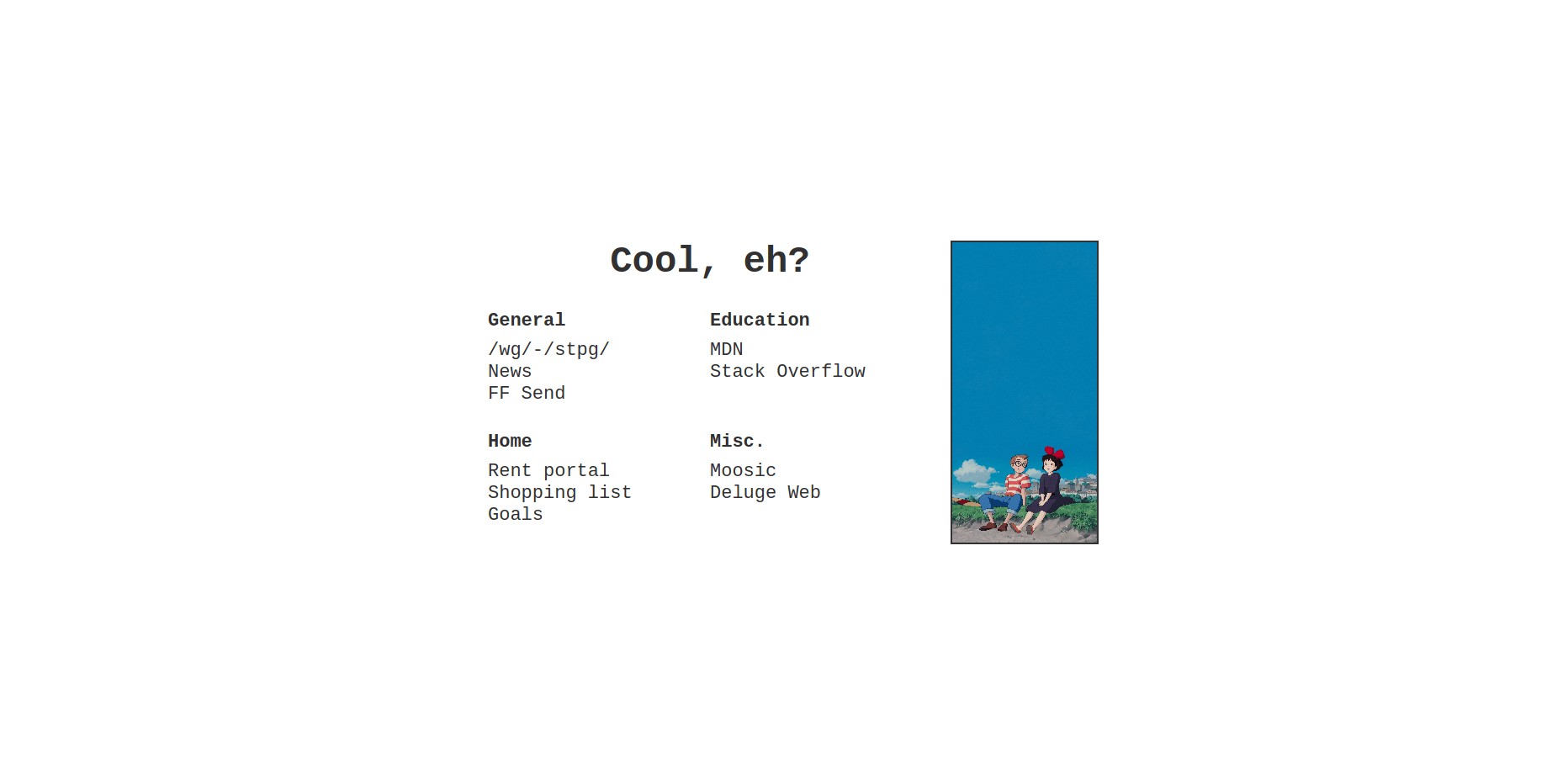
To bring everything together, let's add an image. (I'm using a stitch I made from Kiki's Delivery service).
...
  <img src="https://i.ibb.co/3TP4CJt/cosy.png">
</body>
...
...
    li:first-child {
      font-weight: bold;
      line-height: 2em;
    }

    img {
      border: 2px solid #313131;
      height: auto;
      object-fit: cover;
      object-position: 50% 100%;
      width: 8em;
    }
  </style>
</head>
...
 - Hey presto!
If you've come this far, read through everything, and created your very own startpage: well done! This stuff is confusing, especially for people who have no experience in development.
There are many more things you can do to this startpage, perhaps start by adding more links.
If you are looking for the full HTML file, it's here. You can also check the full git repository.